20/10/15
The 180-degree rule is a guideline in film making. An imaginary line called the axis connects the characters, and by keeping the camera on one side of this axis for every shot in the scene, the first character is always frame right of the second character, who is then always frame left of the first. The 180-degree rule enables the audience to visually connect with unseen movement happening around and behind the immediate subject and is important in the narration of battle scenes. It helps so the audience can connect to the two characters in question visually without every other thing going behind the characters distracting the audience. The camera must always be facing at the center between the characters.
The 180 rule also helps the audience with facial recognition and detail of the characters in the scene, because it can show their emotions, whereas in a long shot we won't visually see what the characters are feeling. We may here and listen, but they must seen. It helps with the continuity of the scene in the movie, so that it helps the audience understand the relationship between the characters whether they are just friends talking, or enemies negotiating peace.
Wednesday, 21 October 2015
My inforgraphic poster
20/10/15
My infographic poster was all made on Photoshop including the text.
Perhaps maybe I should've reordered the percentages in order by smallest to largest. I would probably choose another colour triad on account of the dirty gold colour, but i guess i was stuck.
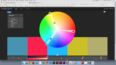
My infographic poster was all made on Photoshop including the text.
I actually had a bit of fun doing this poster to be honest. I could not find a better icon symbolising an early pass, but when I thought of 'early pass' the first thing that came to my head was 'ticket.'

Monday, 19 October 2015
Reflecting on my postcard
15/10/15
The top on I do feel appeals to my audience because it helps reflect their youth 50 years ago or so. It is appealing because postcards have always been a very history of Britain. But I would probably choose different photographs that does not revolve around the River Avon more around things like .
Sunday, 18 October 2015
Filming on location
13/10/15
Today we went out to film at Green Park.
We were successful in filming the park bench, but we had a few issues with the set.
The following:
Today we went out to film at Green Park.
We were successful in filming the park bench, but we had a few issues with the set.
This short film features a cup of coffee and bottled water with The Carpenters' Close to You playing in the background. Then a banana comes out of nowhere trying to knock out the bottle, only missing by it's cap, but then the bottle falls over.
- The sun behind us was casting our shadows into the shot, because it in the morning
- We didn't come prepared for the temperature conditions
- We could not keep our footages timeline accurate
But despite all that, we did very good on filming our little random movie. Its just all we needed to make it better was have a pre-production.
Friday, 16 October 2015
More monday lessons
12/10/15
Today we're covering more about CVs. My personal statements needed a bit of fine tuning, but it's improved. A personal statement is a part of a CV where you give yourself to the interviewer about your personal details, except not too much details.
Today we're covering more about CVs. My personal statements needed a bit of fine tuning, but it's improved. A personal statement is a part of a CV where you give yourself to the interviewer about your personal details, except not too much details.
Thursday, 15 October 2015
Types of photograph elements
01/10/15
Rule of Thirds
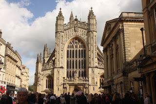

This is the photograph of a cat with the rule of thirds, the cat has been placed to the left of the image along with the imaginary three lines to create the interest of the photograph. This photograph of the cathedral is using the Rule of Thirds by aligning one of the vertical lines with the building on the right.
Cat © https://enmanscamera.wordpress.com/tag/picture/
Viewpoint

This is a bird's eye viewpoint of Bath, it creates interest because the person who sees the image will see the whole of the city and how big it is. Unfortunately i do not have my own example of a Viewpoint.
Bath © https://en.wikipedia.org/wiki/Wikipedia:Featured_picture_candidates/July-2014
Depth of Field


This St. Bernard can be seen clearly while the background behind him is blurry, because it is called Depth of Field. The photographer did this, because wants to make the dog the point of interest in the photo and not the mountains. The same can be said about the flower I took.
St. Bernard © http://www.petguide.com/blog/dog/top-10-large-breed-dogs/attachment/st-bernard-dog-with-keg-ready-for-rescue-operation/
Symmetry

This photo of the Taj Mahal is interesting, because both sides of the marble building are symmetrical. But also the line in the water leads up to the building. Now what made the photo of this part of the Roman architecture symmetrical was the ram's head and wreaths.
Taj Mahal © https://en.wikipedia.org/wiki/Symmetry#/media/File:Taj_Mahal,_Agra_views_from_around_(85).JPG
Composition

The composition in this image is balanced out by the rocks in the arch and the mountains in the distance behind them, so that it makes the audience lookout into the distance in this picture. So does the leaves and the lamp post to make the audience focus on the Royal Crescent.
Desert photo © https://blogger.googleusercontent.com/img/b/R29vZ2xl/AVvXsEiJi-h7glFTGDZtR_8S3gwvyjUUxvGV1cAMOvAToQdD9GxT7FEgYtKLa457OLCUm1R0NEc-lgvbyllG1JPIp1u9PwKQxfSGgD-XRmcnirFbfqDJxd55kuSL0Ljwp7f1YRHQJrxf6vX1uG78/s1600/natural-framing-photography.jpg
Rule of Thirds


This is the photograph of a cat with the rule of thirds, the cat has been placed to the left of the image along with the imaginary three lines to create the interest of the photograph. This photograph of the cathedral is using the Rule of Thirds by aligning one of the vertical lines with the building on the right.
Cat © https://enmanscamera.wordpress.com/tag/picture/
Viewpoint

This is a bird's eye viewpoint of Bath, it creates interest because the person who sees the image will see the whole of the city and how big it is. Unfortunately i do not have my own example of a Viewpoint.
Bath © https://en.wikipedia.org/wiki/Wikipedia:Featured_picture_candidates/July-2014
Depth of Field


This St. Bernard can be seen clearly while the background behind him is blurry, because it is called Depth of Field. The photographer did this, because wants to make the dog the point of interest in the photo and not the mountains. The same can be said about the flower I took.
St. Bernard © http://www.petguide.com/blog/dog/top-10-large-breed-dogs/attachment/st-bernard-dog-with-keg-ready-for-rescue-operation/
Symmetry
This photo of the Taj Mahal is interesting, because both sides of the marble building are symmetrical. But also the line in the water leads up to the building. Now what made the photo of this part of the Roman architecture symmetrical was the ram's head and wreaths.
Taj Mahal © https://en.wikipedia.org/wiki/Symmetry#/media/File:Taj_Mahal,_Agra_views_from_around_(85).JPG
Composition

The composition in this image is balanced out by the rocks in the arch and the mountains in the distance behind them, so that it makes the audience lookout into the distance in this picture. So does the leaves and the lamp post to make the audience focus on the Royal Crescent.
Desert photo © https://blogger.googleusercontent.com/img/b/R29vZ2xl/AVvXsEiJi-h7glFTGDZtR_8S3gwvyjUUxvGV1cAMOvAToQdD9GxT7FEgYtKLa457OLCUm1R0NEc-lgvbyllG1JPIp1u9PwKQxfSGgD-XRmcnirFbfqDJxd55kuSL0Ljwp7f1YRHQJrxf6vX1uG78/s1600/natural-framing-photography.jpg
Photography techniques
15/10/15
Every type of photography requires a separate set of skills and photography equipment (although some overlap). With these Photography Technique Overview guides on photo.net, we look to impart some of these skills to you, whether the subject you're interested in is Macro Photography, Architectural Photography, Portrait Photography, Nature Photography, etc. Each article offers tips on how best to approach the subject, example photographs, and even suggests photography gear to use. As with any creative pursuit, it's important to find your niche, but also important to keep exploring, keep building skills, continue to challenge yourself to learn new techniques. These articles may help you do so.
Every type of photography requires a separate set of skills and photography equipment (although some overlap). With these Photography Technique Overview guides on photo.net, we look to impart some of these skills to you, whether the subject you're interested in is Macro Photography, Architectural Photography, Portrait Photography, Nature Photography, etc. Each article offers tips on how best to approach the subject, example photographs, and even suggests photography gear to use. As with any creative pursuit, it's important to find your niche, but also important to keep exploring, keep building skills, continue to challenge yourself to learn new techniques. These articles may help you do so.
Primary and Secondary research
15/10/15
Primary research is generally research that you do yourself. Many types of primary research include surveys, focus groups, interviews, and experiments. (For example, three pie charts showing the demographics of postcard collectors, by their age, gender and how much they would pay for a postcard, I put together as a result of my survey.) I acted on my survey by the responses and I went ahead and made my vintage style postcard, because i was told that's what they like. If i were to improve my survey, I would add much more quality questions. I would possibly ask more females or more age groups to balance out the results for my questions.
Secondary research is research that is done by somebody else. Many types of secondary research may include the internet, books, other people's work, "newspaper, magazine and journal content, and government and NGO statistics." (Wikipedia.) (For example, this table explaining the difference between primary and secondary research.)
Wednesday, 14 October 2015
The Godfather re-enactment
07/10/15
Today we were put into groups of four to re-enact a scene from a movie, The Wolf of Wall Street was a three out of four choice, but due to a number limit of people for the scene we went for The Godfather opening scene.
It only required two people to play Bonasera and Don Corleone, I read the script perfectly but the problem was my throat was dry and there was no way I could be able to do my Italian accent. Personally I wanted to play Don Corleone, but I would possibly only sound silly to the others.
Original scene
Tuesday, 13 October 2015
Infographics
13/10/15
In today's lesson we learned about Adobe Illustrator tools and how they are operated. I can use them to make graphics for info graphics.
In today's lesson we learned about Adobe Illustrator tools and how they are operated. I can use them to make graphics for info graphics.
Thursday, 8 October 2015
Survey responses
08/10/15
Survey responses
In question 6 there have been some mixed answers that could not be put into a chart.
Survey responses
In question 6 there have been some mixed answers that could not be put into a chart.
Vintage photo
08/10/15
Today we've been told to make a vintage photograph and here's what I did. I did this by a 'Darkening' tool on the layer with the grain effect, while I gave one layer of the cathedral a Colour halftone filter to improve the quality of the photograph to look aged. I then copied the same layer with the colour halftone two times to improve it.
Tuesday, 6 October 2015
Investigating type and layout
06/10/15
Migration - movement from one part of something to another.
Expansion - the action of becoming larger or more extensive.
Migration - movement from one part of something to another.
Expansion - the action of becoming larger or more extensive.
Monday lessons
05/10/15
Today Leanne had a talk today with us about how we were meant to set our CVs out.
She said we should put our details down except our D.O.B. because though the interviewers don't discriminate age, they won't give you the job if you reveal your age.
The skills you need to get a job is in literacy, numeracy, presentation, time management, strong work ethic and collaboration.
Last week or a few weeks back, we all took a resilience test. My score is 74, which I guess it's good.
Ted Bennett
Industrial Designer
4 Box Cottages
The Platt
Dormansland
RH7
07429577313
teddobennett@googlemail.com
Personal statement
I am from a small village in Surrey called Dormansland, i came all the way there to study Media at City of Bath College.
Qualifications
St. Dominic’s, Godalming - GCSE
September 2012 - July 2015
- Maths
- English
- Media
Sunnydown Boy’s School, Caterham - GCSE
September 2007 - July 2012
- History
- Geography
- Art
- Design Technology
- Religious Education
Work experience/skills
SP Commissioning, Dormansland - Degree
June 2011 - June 2011
I started work experience at a Commissioning agency, dismantling hardware from old computers and labelling the hardware.
Hobbies and Interests
I spend my time on the internet, paint models and play video games.
References
Liz Johnstone
Lawrence Miller
Sniper Pug by Tomska
06/10/15
It is about a team of British soldiers/commandos and they are trying to take out a group of terrorists. But their sniper is a dog.
It is about a team of British soldiers/commandos and they are trying to take out a group of terrorists. But their sniper is a dog.
- The captain of the team gives them a brief about a bomb and they need to take the terrorists out.
- He introduces them to 'Sergeant Pugsley', which one of them (played by Tom) is asking why is he a dog. Unfortunately the captain is not listening to Private Tom.
2. They go in taking out the terrorists, but Private Tom is still questioning about Sergeant Pugsley.
- The terrorists ambush the soldiers, the captain admits to the team that their sniper is a dog and were prepared to surrender, but then Sergeant Pugsley begins to shoot the terrorists.
3. Private Tom finally admits that he is a good sniper and salutes to him, but then they turn around to see a cat in a car with the bomb and detonates it. The film ends with Pugsley standing in front of an army graveyard.
Monday, 5 October 2015
9. A grid
02/10/15
A grid is the structure made of a series of straight or curved lines used to build content.
It serves as a framework on which the designer can organise his/her graphics in an easy sort of way. A grid can be used to organize graphic elements in relation to a page, in relation to other graphic elements on the page, or relation to other parts of the same graphic element or shape. While grid systems have seen significant use in print media, interest from web developers has only recently seen a resurgence. Website design frameworks producing HTML and CSS had existed for a while before newer frameworks popularised the use of grid-based layouts. Some grid systems specify fixed-width elements with pixels, and some are 'fluid', meaning that they call for page element sizing to be in associated with units like percentages, rather than absolute units like pixels or points.
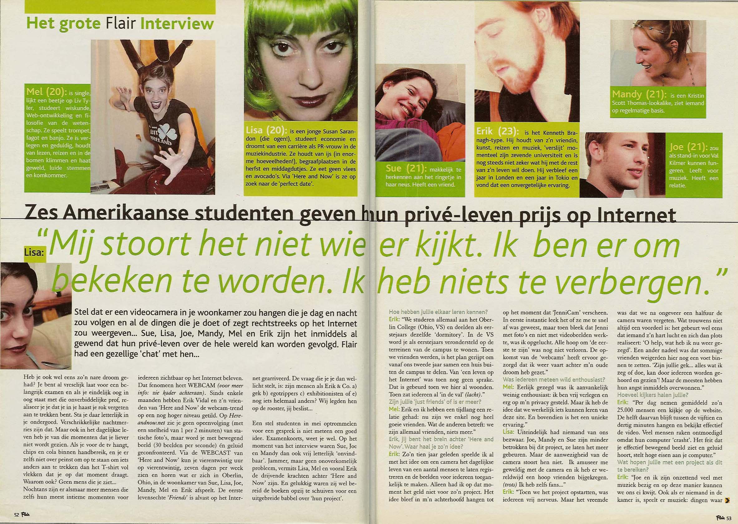
The grids are also set out into two layouts: vertical and landscape. There are also only those types of grids. One that has an even number of columns and one that has an odd number of columns. An experienced designer knows that a specific style of design can only be achieved by an odd number of columns, or alternatively, by using an even number of columns. Illustrated below are common examples of layouts using basic layout grids. Learning to choose the right grid for your design is crucial to its success.
The grid layout also are implied in webpages. The main idea behind grid-based designs is a solid visual and structural balance of web-sites you can create with them. Sophisticated layout structures offer more flexibility and enhance the visual experience of visitors. In fact, users can easier follow the consistency of the page, while developers can update the layout in a well thought-out, consistent way. However, it’s quite hard to find your way through all the theory behind grid systems: it isn’t easy at all. Some important notions and related key-facts can help to learn basics and keep essential techniques in mind.

In overall conclusion, the grid is and has been the first step for graphic designers everywhere on achieving graphics on paper with excellent results. They shaped the way we look on society. They help shape the media industry throughout the entire past century, if they have a way to still do that in the present, then they can surely have a way to shape our future.
Sources (C) Wikipedia, DesignersInsights.com, Graphics.com, Guity-Novin
A grid is the structure made of a series of straight or curved lines used to build content.
It serves as a framework on which the designer can organise his/her graphics in an easy sort of way. A grid can be used to organize graphic elements in relation to a page, in relation to other graphic elements on the page, or relation to other parts of the same graphic element or shape. While grid systems have seen significant use in print media, interest from web developers has only recently seen a resurgence. Website design frameworks producing HTML and CSS had existed for a while before newer frameworks popularised the use of grid-based layouts. Some grid systems specify fixed-width elements with pixels, and some are 'fluid', meaning that they call for page element sizing to be in associated with units like percentages, rather than absolute units like pixels or points.
This facsimile page is from a fourteenth-century English manuscript. The overall layout is asymmetric, and therefore surprisingly modern. The main column is positioned to the left of the page, with a large right-hand margin used for notes. All text is calligraphic and ranged left.
This old Russian newspaper, telling the events after the USSR collapsed, is laid out with the main images on top underneath the headline, but the columns are all mixed up in all different places of the paper.
The grid layout also are implied in webpages. The main idea behind grid-based designs is a solid visual and structural balance of web-sites you can create with them. Sophisticated layout structures offer more flexibility and enhance the visual experience of visitors. In fact, users can easier follow the consistency of the page, while developers can update the layout in a well thought-out, consistent way. However, it’s quite hard to find your way through all the theory behind grid systems: it isn’t easy at all. Some important notions and related key-facts can help to learn basics and keep essential techniques in mind.


Landscape Vertical
In overall conclusion, the grid is and has been the first step for graphic designers everywhere on achieving graphics on paper with excellent results. They shaped the way we look on society. They help shape the media industry throughout the entire past century, if they have a way to still do that in the present, then they can surely have a way to shape our future.
Sources (C) Wikipedia, DesignersInsights.com, Graphics.com, Guity-Novin
Labels:
type and layout
8. Magazine pages
02/10/15
I chose Archery UK which has many different sections in it. This is a quarterly magazine and has a lot of content. Because there is a lot of content, the magazine has been divided into different sections. The sections use different colour coding on every page to make it easier to for the reader to find a certain page he/she is looking for. The primary headlines are generally in a variety of bold, san serif fonts, with secondary headlines also in san serif. The general texts of the articles are in a san serif but is in a much smaller size. The colour scheme of the articles has been chosen to draw the reader in, including the headings. The magazine designer has also added colour and a different size capital letter for the beginning of every article throughout, again get the attention of the reader and to indicate the begging of an article. The junior section uses a much more varied colour scheme, interesting design and font to make it look more fun and appealing to younger person(s).
I chose Archery UK which has many different sections in it. This is a quarterly magazine and has a lot of content. Because there is a lot of content, the magazine has been divided into different sections. The sections use different colour coding on every page to make it easier to for the reader to find a certain page he/she is looking for. The primary headlines are generally in a variety of bold, san serif fonts, with secondary headlines also in san serif. The general texts of the articles are in a san serif but is in a much smaller size. The colour scheme of the articles has been chosen to draw the reader in, including the headings. The magazine designer has also added colour and a different size capital letter for the beginning of every article throughout, again get the attention of the reader and to indicate the begging of an article. The junior section uses a much more varied colour scheme, interesting design and font to make it look more fun and appealing to younger person(s).
Labels:
type and layout
7. Leading
02/10/15
Leading is adjusting the space between lines of text.
The top paragraph shows 21 pt size with 25 pt leading. the bottom paragraph shows also 21 pt size, but with 45 pt leading.
Leading is adjusting the space between lines of text.
The top paragraph shows 21 pt size with 25 pt leading. the bottom paragraph shows also 21 pt size, but with 45 pt leading.
Labels:
type and layout
6. Kerning and Tracking
02/10/15
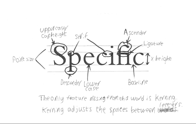
Tracking is literally when you make overall space between letters in a word(s). Whereas kerning is when you adjust the space between specific letters.
Tracking is literally when you make overall space between letters in a word(s). Whereas kerning is when you adjust the space between specific letters.
Labels:
type and layout
5. Type Family
02/10/15
The image below shows a specific type family.
The biggest type family i could find on InDesign is Avenir. I have only shown six examples of the font below.
The image below shows a specific type family.
The biggest type family i could find on InDesign is Avenir. I have only shown six examples of the font below.
Labels:
type and layout
Friday, 2 October 2015
S.M.A.R.T
09/09/15
We talked about SMART targets and what they are.
S stands for Specific
M stands for Measurable
A stands for Achievable
R stands for Realistic
T stands for Time
M stands for Measurable
A stands for Achievable
R stands for Realistic
T stands for Time
- I also created my own target; I will not play on my phone during lessons for the duration of the term.
- As a class we talked through the college Code of Conduct.
- And we talked about how we should save our work on our personal space.
- I wrote a lesson to myself listing three things I would like to achieve before the end of the college year.
Postcard experimentation
01/10/15
I went ahead and pasted an image of one of the places in Bath.
When things became complicated for the second image, I opened up the file it was in and dragged it in.
And I succeeded!
I added the coat of arms of Bath and used the Magic Wand tool to edit out the white background.
Then I added the finishing touches to it, by typing down 'City of Bath', used the font Luminari Regular and coloured the words in blue, because it is calming colour and it represents the water in the baths. I added a white shape to help make the words stand out.
UPDATE: The bus did give a clue of what it was representing. But I didn't actually like all of the photos, because there was no representation of Bath, but these photos are not technically mine. I could have have taken photos of things that REPRESENTS Bath, such as the statue of King Bladud or the Roman Baths.
Labels:
CityofBath,
photoshop,
postcard
Subscribe to:
Comments (Atom)


